Thursday, November 18, 2010
{Collective:Collage}
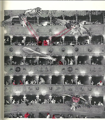
For the past three or so months I have been traveling, exploring and learning so many new things. I am now currently in Amsterdam, and felt this great desire to start creating again!!!
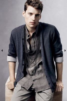
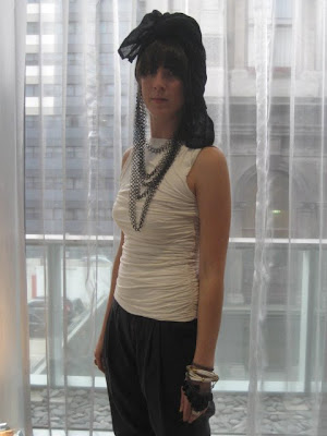
This is a collection of my favorite collages I have made through my time traveling around Europe and New York.
LOVEhelen
Wednesday, August 4, 2010
In celebration of our hard hard work, My good friend Christina M, decided that we should have a little fashion show. We both showcased our design creations from over the past year. I included my Decorative Technique Mod Dress, Menswear and Ornamental Menswear. While Christina (her label; EXIE) exhibited her Stretch-wear, Tailoring and her AMAZING Accessories!
Here are the photos of my pieces, and Definitely take a look at the whole collection and Christina’s work. It was a small intermit show, and super fun!!!
LOVEhelen
Click here for all the Photos from the show!
Photos Taken By: An Architect Photographed my Undies
Who works for: Design Federation
Tuesday, August 3, 2010
Country Road Styling Workshop
I've been BURSTING to share this exciting news with you for AGES!!! But was sworn to secrecy until the release day.
That day is now here!!!!!
On Friday the 21st of May Country Road proposed that 10 fashion design students from RMIT would collaborate with them, in styling 4 looks for the Spring Summer 2010 Collection.
Being one of these 10 students, I was lucky enough to be briefed (and given a sneak peak) of the range. After this introduction, we were left to practically play dress-ups for a few hours with the entire collection, and create approximately three looks each. This was a dream come true! Dressing up really has to be one of my favorite games to play! ….maybe even the only game which I do play!
After the end of this fantastic experience, the Country Road team selected only four looks from the entire day. These four looks have been photographed by the Fashion Photographer Daniel Jackson in New York, and are also included in the current Country Road Catalog.
I am Thrilled that myself along with my other friends (and great students) were selected not only for this wonderful experience, but also the opportunity to work with Country Road. Myself along with the other three finalists are currently in the Spring Summer Catalog for 2010.
The top image is the Selected styled look, photographed my D.Jackson. And the remaining images are my own, showing the other looks that I developed.
All garments and most accessories are from Country Road, some accessories are my own.
LOVEhelen
http://www.countryroad.com.au/#/catalogues/spring_summer_2010/26
http://www.thevine.com.au/tv/watch/country-road-workshop20100723.aspx
Displays of Luxury
Today I finally took myself to the new (well at least new do my eyes) Chadstone.
I was extremely impressed; the entire centre was modern and very exciting. Considering the shear size of Chadstone, being it’s own suburb, it was surprisingly very easy to navigate around. With snazzy touch screen computer maps, shop finders and “how to get to the store your looking for” maps!!! (I needed this one!), it was a nice change from my usual street shopping in the City and Chapel street.
But what I was most exciting for me was the Miu Miu store. It kind of was the reasoning of me going!!
While I am aware of the reasons why high end Luxury Giants are reaching further than just the upper-class consumer. It really is a cleaver move, because little fashionistas like me come in and swoon over everything, while product consuming broadens. Win Win!
I love the store, the exterior, the interior, the window display, the product, the atmosphere. It really is a luxury store. The window display mannequin was beautiful. Reminiscent of the Surrealist inspired, Cristobal Balenciaga perfume window display from the 1950s and the popular fashion mode mannequins also from the Golden Age.
Very Clever Prada!
LOVEhelen
Thursday, July 29, 2010
2009 Opening Party, L'Oreal Melbourne Fashion Festival
While my life seems to be particularly hectic and busy right now. I’ve just had the luxury of a free hour to myself, with nothing too urgent needing to be done. Well…. Nothing urgent that I could think of!!! =S
So during this lavish time of freedom, I as usual, began doing a little internet browsing, looking at fashion, and other exciting creative things! And I reignited my fondness to one particular fashion show which I had previously worked on.
During L’Oreal Melbourne Fashion Festival in 2009 I was lucky enough to not only be helping out as a dresser for the show, but was also a Stylist’s Assistant and a budding Volunteer. It really was a great thrill to be working in this festival, and a great privilege to be working specifically closely with the Opening Party.
What I Love about this 2009 Opening Party Fashion Show was that it really embodied all the incredible talent which the Australian Fashion Industry offers to cultural society. I was completely blown away when I was dressing these girls, as the immaculate detail and consideration to craft, construction and technique amazed me. I feel that the pieces selected for this opening show really illustrated how wonderful the Australian Design circle is, and how much our style is able to be freely interpreted. What was so lovely and cleaver about the styling, was that it not only celebrated Australian Designers, but also beautifully Illustrated the progression of style through time. I truly love this representation of history, and I feel that this show was styled particularly well. It is such a shame that the second show with these garments (for the public) was so poorly and limply executed.
Here are my Favorite Looks!!!!!
LOVEhelen
All Images from:
http://www.lmff.com.au/index.php?do=gallery&galleryCategoryId=36
Sunday March 14, 2009
Government House, Melbourne
Wednesday, July 21, 2010
Transgressive Collage
After the long and technical process of designing, thinking, and making, it is always fantastic to wrap it all up with a conclusive poster. For the final presentation of the image I decided to create a collage utilizing images of city buildings. I chose to do this as the notion of the men's suit seems to be this repetitive, standard uniform for the city business man. And through repeating and cutting the image of the Business Man's Building, the concept which drove the garment design now drives the 2D direction. As, cutting up all these images of buildings is reminiscent of the slashing of the seams.
Enjoy!
Collage Art: Helen Pappas
Model: Tim C.
Photos: Helen Pappas
Garments: Helen Pappas
Tuesday, July 20, 2010
Transgressive Ornament
It is always lovely to share. And I would love to share with you all what I have been working hard on for the past few months. This is some of my work from my main studio subject at University. Enjoy!
During this past semester I undertook a design subject called "Ornament and Transgression". Through the course of the semester we analyzed the meaning, power and philosophies behind the art of ornamentation. And through this research I came to consider ornament to be something that is special, sacred and in a way, a holy means of linking both the real and the extraordinary worlds. This realization lead me to the drastic need for men's wear to be again released back into it's full power of excess and lavish masculinity. The current social suppression of men's wear is a rule which needs to be violated. Through the physical slashing of the seams in the traditional men's suit, allowed the ornament of the shirt to penetrate through to the surface, and ultimately challenging the notion of acceptable men's attire. I am very pleased with the outcome, both conceptually, decoratively and technically. I hope that you enjoy viewing the outcome as much as I do. It really make me smile!!!
LOVEhelen
All Work and Photos Property of Helen Pappas 2010.
Wednesday, July 14, 2010
A Masculine Femme Fatal
I'm currently in the slow, slow process of cleaning my room, and through this I've begun to look through some of my work folios from last year. I've been wanting to post these pieces for a while now.... but temporarily forgot!! hahah!
Anyway, now they are up! and you can have a look!
I was very interested in the technique of collage. It is an interesting means of producing art, as technically the artist isn't really doing anything, just rearranging and cutting. Well, this isn't really true. Because it is the decision, the thought and the concepts behind the positioning of these ready made images which gives power to their arrangement.
While challenging the image of man through imposing a Lipstick for the body, I've also questions the masculinity of lipstick. While this cosmetic product optimizes the iconic seductive femme fatal, the design itself is quite phallic. With its retractable red rouge stick capable of coating a woman's lips, I've discovered that the simple Lipstick is actually a very complex thing. It is through these collages, that I've played with this idea of the lipstick being both iconically feminine, but also metaphorically masculine.
I really like the outcome!
LOVEhelen
Tuesday, July 13, 2010
Adriana Varejao
It is interesting to look at Lucio Fontana's works from the late 1960s and actually realize how influential they have been on the art world. This piece by Adriana Varejao and also many others of hers question what lies beyond the piece, both physically and psychologically. Countless pieces by Varejao are violently ripped up, revealing the bloody, fleshy and pulsing organs beneath the surface of the work. This illusion, or more correctly Varejao's presentation of art being something that is alive, beating and in a way capable of feeling draws links towards Fontana's philosophies. We see that she is potentially trying to communicate the power of art becoming more than just an image, but being emotive and soulful. This notion being one which I see Fontana not only also addressing, but initiating.
LOVEhelen
Images from:
www.ngv.vic.gov.au
http://lunettesrouges.blog.lemonde.fr/lunettesrouges/2005/05/azulejos_e_saud.html
Monday, July 12, 2010
Spatial Manifestos
Lucio Fontana. What else is there to say.
He is, in my eyes, one of the most progressive, challenging and exciting artists of the 20th Century.
Fontana was born in 1899, Argentina, and died 1968. His initial practice in sculpture, I feel, has given him a unique, more analytical approach towards his paintings. What I have found most interesting about his works, is that Fontana not only questions the power of the image which he makes but take this further, and questions the power of the canvas. Through his slashing of the canvas, he not only violates the very foundation of the artists' image, but actively highlights what lies beyond the canvas. Our minds seem to always extend the image beyond the frame, yet it is Fontana's disruption of the surface which physical opens-up the world of art to a more conceptual view on painting.
There is a lots of informations out there about Lucio Fontana, he collaboration with other artists in writing Artistic Manifestos, such as Manifesto Blanco (1946). And also initiated the artistc movement of Spatialism.
Through out this semester of Uni, I have countlessly found his works a vibrant source of inspiration, both technically and conceptually. I find Fontana's work challenging and I really love them more each time I review them.
If you are interested in Lucio Fontana's work, you don't have to go far to see an original!!!! The NGV International Gallery on St Kilda Road, Melbourne has one of his pieces in their permanent collection. .........it's gold!
LOVEhelen
Subscribe to:
Posts (Atom)